 ReliCheck MM Studio · Plain-English Teaching Guide
Joint Displays · Worked Example
ReliCheck MM Studio · Plain-English Teaching Guide
Joint Displays · Worked Example
 Mixed Methods · Teaching Guide 01
Building a Joint Display
What these numbers and words say together: one joint display built start to finish in MM Studio
Explained from scratch for researchers who are comfortable with numbers and new to integration.
You do not need a qualitative methods course. Every term is defined the first time it appears, in plain words, right before you need it. The point is not the menu path. The point is what each number and quote is doing in the table.
One puzzle runs the whole guide: same coaching program at two clinics; Northside gains confidence and improves more; Lakeview shows up, but clinical numbers stay flatter. The joint display is where that puzzle stops being two reports stapled together.
Six themes, each paired with the statistical result that speaks to it, and twenty-three patients whose numbers and words do not match. The joint display is where a mixed methods study stops being proximity and becomes integration.
What is a joint display, really?
Set the name aside and picture the problem. You have finished the numbers: an independent-samples test says self-efficacy differs between clinics; a chi-square says who improved differs too. You have finished the words: six themes coded across fifty open responses. Two sets of findings, both solid, sitting in separate documents.
Now what?
The honest answer for much published mixed methods work is: not much. The numbers go in one section, the themes go in another, and the discussion says both were considered. That is not integration. That is proximity.
A joint display is a table that puts one strand’s evidence next to the other’s, row by row, so that agreement and disagreement become visible rather than asserted.
Integration is a claim about relationship: these numbers and these words point the same way, or they do not. A claim about relationship needs both things in view. Prose can assert a relationship. A table shows it, and shows it row by row where a reader can check you.
That single property – both strands visible together – is the whole idea. Everything else in this guide is about building the table honestly, and reading what it says about this diabetes coaching study.
What both strands already showed (so the display has something to say)
A joint display cannot invent evidence. It can only arrange evidence you already earned. In this study, the quantitative and qualitative strands arrived here carrying specific numbers and theme counts. You need them in view before you merge.
The quantitative strand
The qualitative strand
| Theme | Coded responses | What it is about |
|---|---|---|
| Access | 16 | Cost, insurance, food – the barrier theme; loudest voice |
| Care team | 12 | Coach / nurse / coordinator relationship and continuity |
| Confidence / control | 9 | Patients describing real self-management |
| Support | 6 | Family and peers |
| Overwhelm | 5 | Plan felt like too much early on |
| Transportation | 3 | Getting there – thin but real |
If you open a joint display without knowing that Access is the barrier theme and that the A1C gap is significant, the table is just columns. Integration starts as memory of what each strand already claimed.
What has to be true before you merge
You cannot merge what is not finished. Before the joint display is available, each theme row needs three things.
- 01Coded evidence. The theme exists, responses are coded to it, and it has a definition another researcher could apply. (That definition work lives in the codebook – short definition, full description, inclusion and exclusion rules, borderline cases. Quant reproducibility is free; coding reproducibility is built.)
- 02A linked quantitative result. Not any result – the result that speaks to that theme. Confidence themes pair with the self-efficacy t-test. Outcome themes pair with the A1C chi-square. That pairing is a judgment. Making it deliberately is what stops a joint display from being decoration.
- 03A representative quote. One patient’s actual words, chosen to stand for the theme – or an honest empty slot until the right quote exists.
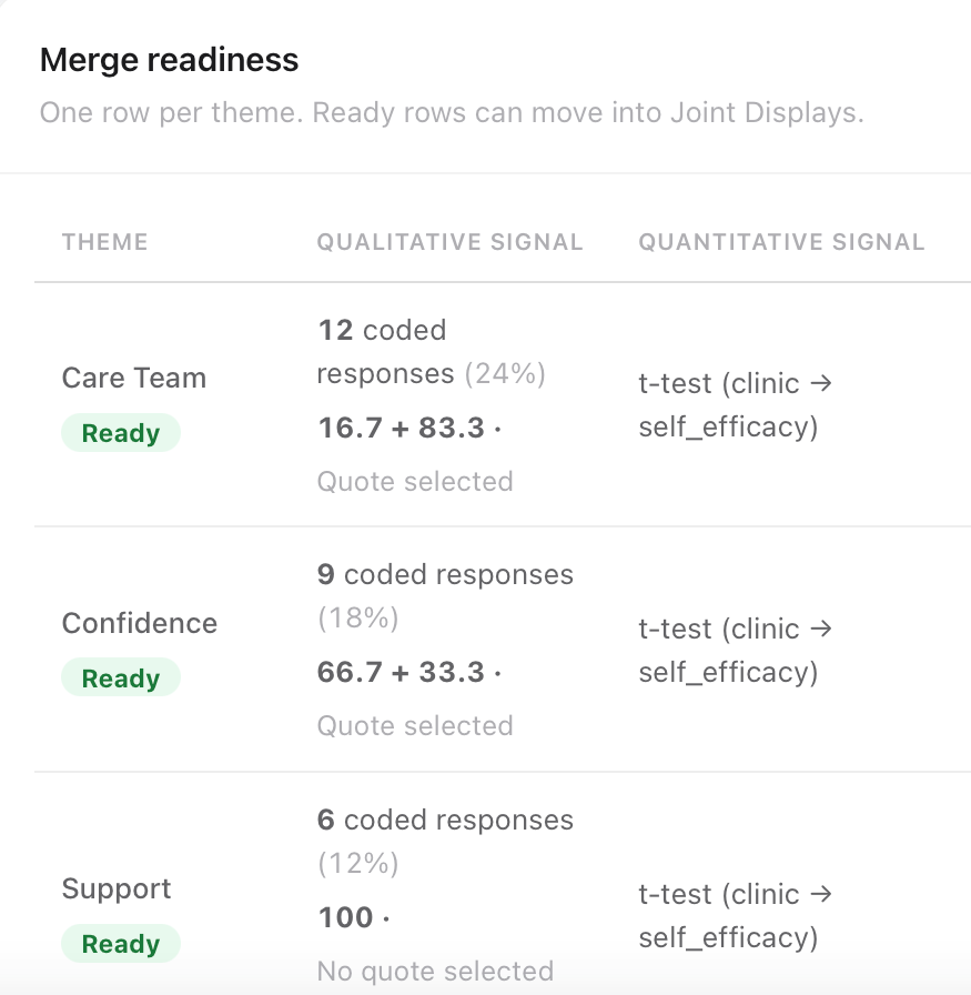
In MM Studio, Merge and compare puts one row per theme and reports across the top how many themes have coded evidence, how many have a quant result linked, and how many are ready to compare. In this study: six themes, all six with coded evidence, all six with a result linked, all six ready.
Coverage 12 coded responses (24%), sentiment mix, quote selected, linked t-test of self-efficacy by clinic, p = .009. Next action: build joint display.
Coded evidence and linked statistic in place, but “no quote selected.” Next action: choose quote later. That is fine. Stage the row; fill the gap.
What you must not do is build the display while a row is still missing its link. The missing link is exactly where an unexamined assumption hides.
The theme joint display – four columns that do real work
The first view is one row per theme. It lines up four things: how often the theme appeared, the statistical result tied to it, the sentiment of those responses, and a representative quote.
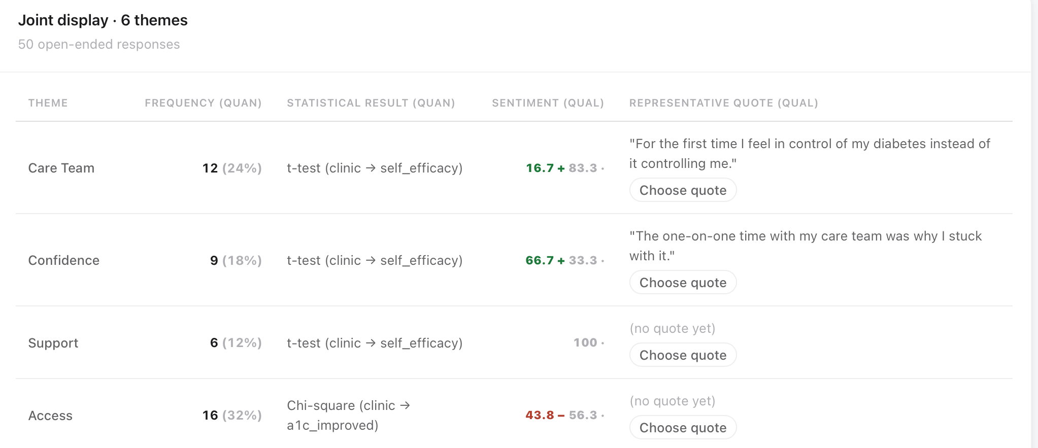
Care team: 12 responses, 24% coverage, paired with the self-efficacy t-test (p = .009), sentiment strongly positive.
Access: 16 responses, 32% coverage, paired with a different test – the A1C chi-square (p = .017) – and sentiment that leans negative (~44% positive / 56% negative) while every other theme leans positive.
Care team is a confidence theme, so it pairs with the confidence test. Access is an outcome theme, so it pairs with the outcome test. A joint display that pairs every theme with the same statistic is not integrating. It is repeating.
Access is the only theme leaning negative, and it is also the only theme tied to the outcome test. The tone and the numbers already point the same direction before you write interpretation.
A theme appearing in 32% of responses is not therefore more important than one at 24%. Counting shows how widely something was mentioned. It misleads if you treat it as weight. Report the count; interpret the meaning. Access matters here because of where its responses sit (with non-improvers), not because 16 > 12.
Suppose you linked Access to the self-efficacy t-test because “everything goes with the big significant result.” The display would then show a barrier theme next to a confidence gap. Readers would infer that Access “explains” confidence differences, while the clinical non-improvement pattern – the actual puzzle – would be unmoored from its right test. Pairing is a construct judgment, not a convenience.
The case matrix – one person, both strands
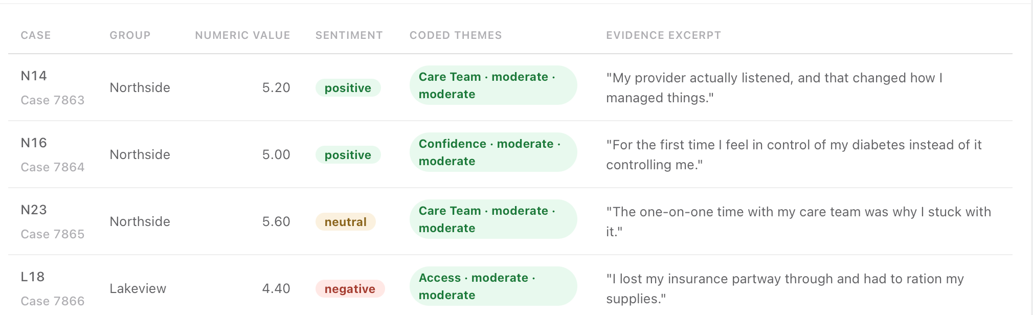
The second view drops to the individual patient. One row per case, tying that person’s number to their own words.
Self-efficacy 5.2 · positive sentiment · coded care team
“My provider actually listened and that changed how I manage things.”
Self-efficacy 4.4 · negative sentiment · coded access
“I lost my insurance partway through and had to ration my supplies.”
That is the convergent design in a single line, twice over: the number and the reason for it, sitting together, for one real person.
The theme display works at the group level. Group-level agreement can hide individual-level contradiction. Two clinics can differ on average while people inside each clinic behave like the other. The case matrix is where you find out. It is also where the study stops being about categories and becomes about people – which matters for how you write and for who reads it.
Discordant and negative cases – interrupt your tidy conclusion
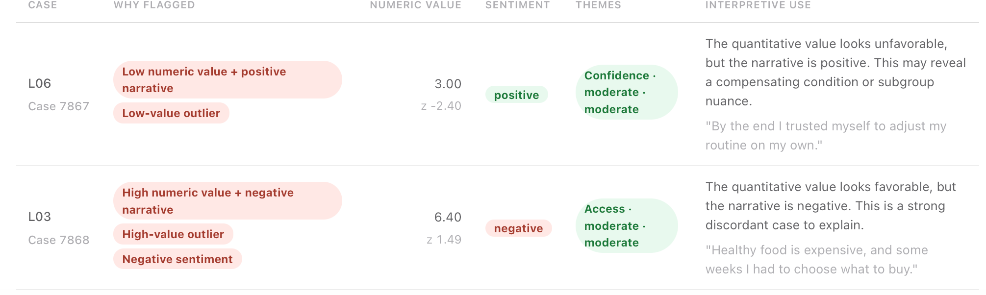
The third view separates a careful study from a tidy one. MM Studio hunts for patients who do not fit the pattern, before you write your claim.
Number low: a 3, more than two SDs below the mean. Narrative positive – trusted themselves to adjust their routine. Low score, hopeful story. Worth understanding, not smoothing away.
Number favorable: 6.4. Narrative hard: “Healthy food is expensive, and some weeks I had to choose what to buy.” Good-looking score, resource barrier underneath.
Every researcher has a conclusion forming by this stage. The discordant view exists to interrupt it. Good qualitative work has always looked hardest at cases that argue against the finding. Here the search is automatic rather than depending on your willingness to go looking.
A case that contradicts your pattern is not a problem with your data. It is usually the most informative row in the study.
What to do: not delete them, not explain them away. Read them. Decide whether they complicate your claim, qualify it, or break it. L03 is the row that should stop you writing “Lakeview patients had worse outcomes because they were less engaged” – the number says engaged; the words say the barrier was money.
Choosing a representative quote is an analytical act
Each theme carries one patient’s words into the display. That choice is not a design flourish.
Rules of thumb
- Choose for typicality, not for power. The most quotable line is often the most extreme. A quote that stands for a theme should sound like the middle of that theme, not its edge.
- Choose one you would defend. If a reader went back to the coded responses, would they agree this quote represents the group? That is the test.
- Do not choose to make a point the numbers do not support. A vivid quote next to a non-significant statistic reads as evidence to most readers, whatever your caveat says.
- Note when a theme has no good representative. Support in this study can sit ready with evidence and statistic but no quote. Leaving it empty until you find the right one is better than filling it with a convenient one.
If you catch yourself shopping quotes to “sell” Access harder, stop. The joint display already has the 10-of-11 pattern. A theatrical quote is how integration becomes advocacy theater.
What the display is telling you in this study
Step back and read the whole table.
Five themes lean positive and cluster with patients whose numbers moved: care team at ~92% from improvers; confidence in all nine responses; support in all six; transportation and overwhelm in every coded case among improvers.
Access breaks the pattern. Of its 16 responses, 10 come from patients who did not improve (63%). Only 11 patients failed to improve at all – and 10 of their 11 responses are about access: cost, insurance, food.
That is not a small lean. The people whose numbers stayed flat are the same people telling you the barrier was access, not effort.
The numbers alone say Lakeview underperformed. The words alone say some patients struggled with cost. Only the two in one table say the group with flat outcomes is the group describing structural barriers – and that is a different finding with different consequences for a real clinic.
It made the conclusion visible. Visibility is the methodological gift. Assertion without a table is how proximity masquerades as integration.
What the display earns next (so you do not stop early)
A joint display is the centerpiece, not the last word. In MM Studio the honest next moves are:
For each theme: do the strands converge, stay nuanced, or diverge? In this study, care team and confidence converge; support, transportation, and overwhelm are nuanced; Access diverges – and when you mark aggregate-vs-experience divergence, the app sends you back to the contextual lens on purpose. That is the dangerous moment in mixed methods: the number looks like a group failure; the words say resources. Naming the split without explaining it is how blame sneaks back in.
Six lenses – context, voice, position, representation, counter-patterns, consequence – force you to write what must not be concluded. For Access: do not frame Lakeview patients as non-compliant. The barrier is access, not willpower. That sentence is the difference between a finding that helps a clinic and one that harms patients.
- 01The program builds real self-management confidence.
- 02The clinic outcome gap is an access effect, not a program or patient failure.
- 03Care team contact is the engagement lever.
- 04Early overwhelm and transportation are fixable friction.
None of those four come from numbers alone or words alone.
Exit ticket: defend what the display showed
If you can answer these without looking, you understand the display rather than the menus.
Why is care team paired with the t-test and access paired with the chi-square?
A colleague says access is most important because coverage is 32%. What do you say?
What does the case matrix show that the theme display cannot?
L03 has self-efficacy 6.4 and a negative food-cost narrative. Why flag it?
Someone wants “Lakeview patients were less engaged.” What does the display let you say instead?
Six themes, two tests, one table. Five themes agree with the numbers. One does not, and that one carries the study: the patients whose outcomes stayed flat are the patients describing barriers they could not control. The joint display is what made that visible instead of merely arguable.
Report-ready language
Use these when you need manuscript-ready wording for a joint display in this study.
ReliCheck MM Studio · Mixed Methods Teaching Guide 01. Companion to the three-part convergent demo on relicheck.com/demos. Study: Northside vs Lakeview Diabetes Coaching · N = 50.