 ReliCheck MM Studio · Plain-English Teaching Guide
Guide 02 · Quantitative and Qualitative Analysis
ReliCheck MM Studio · Plain-English Teaching Guide
Guide 02 · Quantitative and Qualitative Analysis
 Mixed Methods · Teaching Guide 02 of 03
Quantitative and Qualitative Analysis
Each strand analyzed on its own terms, before the merge
A three-part guide to a full convergent mixed methods study in MM Studio. This is Part 2.
Part 2 runs both analysis strands fully before any integration happens. The quantitative side produces two results: a Welch independent-samples t-test comparing self-efficacy by clinic, and a chi-square test of whether A1C improvement is associated with clinic. Both carry complete diagnostics. The qualitative side produces six themes from fifty open responses.
The guiding constraint through Part 2 is that each strand is finished on its own terms. The t-test result does not wait for what the themes say, and the themes are not built to explain the t-test. Each strand arrives at the merge step carrying its own independently earned evidence. That separation is what gives the merge its credibility.
A significant confidence gap, a significant outcome gap, and a qualitative strand whose loudest theme is about barriers to care, not effort or motivation. The merge step asks whether those three observations say the same thing.
Quantitative Descriptives: what the numbers look like before the tests run
Step 5 in MM Studio is Quantitative Descriptives. It produces group summaries: counts, means, standard deviations, ranges, and missing values, broken out by the grouping variable (clinic). Descriptives do not test anything. They describe. That distinction matters more than it sounds.
The 0.80-point gap between 5.50 and 4.70 is visible in the descriptives table. A gap visible in descriptives is real data, but it is not yet a finding. The descriptives table cannot tell you whether that difference is larger than sampling variability would produce by chance. It cannot tell you whether this gap would replicate. It cannot calculate how large the difference is relative to the spread of scores. Those are exactly what the inferential test does next.
MM Studio’s caution label on the descriptives output reads: “These are averages. They do not test whether differences are statistically significant or explain why they exist.” Read that before showing the table to anyone as a result.
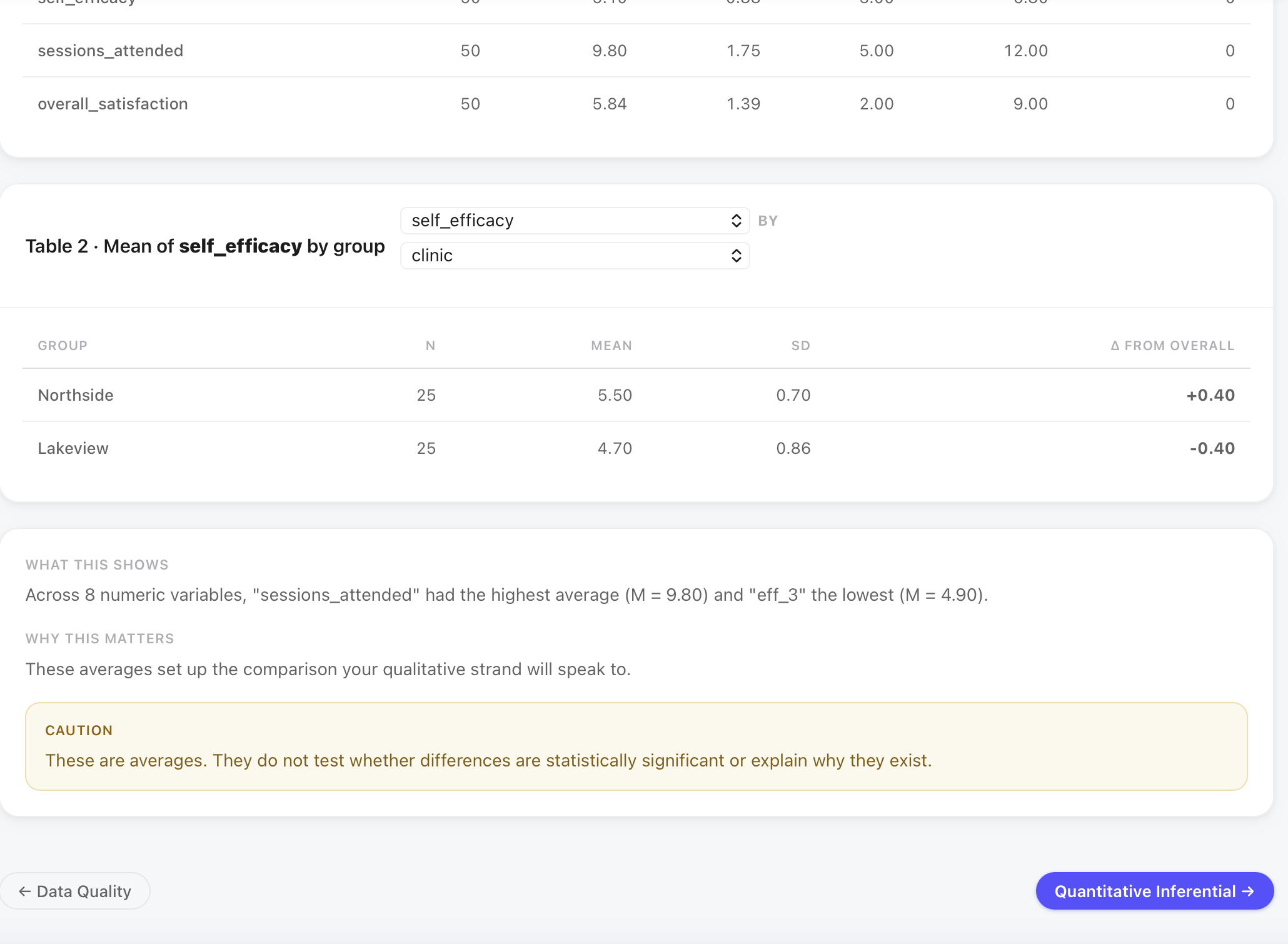
The descriptives also show that sessions_attended had the highest average across the dataset (M = 9.80) and overall_satisfaction was M = 5.84. These context variables will become important in Part 3 when interpreting why engaged patients at Lakeview did not improve at the same rate as Northside patients. A student noting them now, before the inferential tests run, is already asking the right kind of question.
The independent samples t-test: why Welch, and what it tests
The quantitative inferential step (Step 6) runs the test that addresses whether the self-efficacy gap visible in the descriptives is statistically real. The test chosen is an independent samples t-test, comparing the mean of one continuous outcome (self_efficacy) across two independent groups (Northside vs Lakeview).
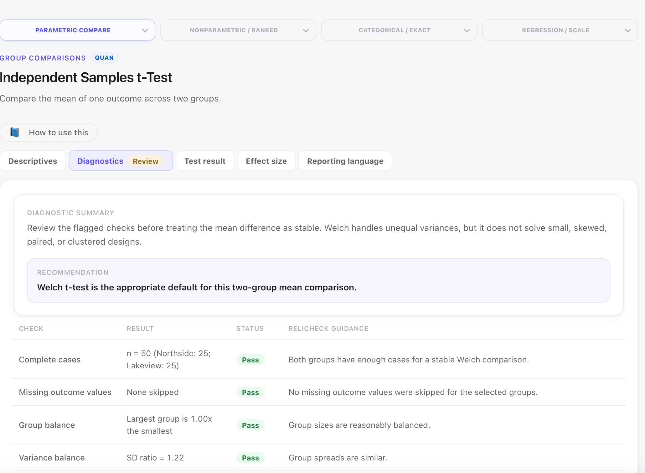
Student’s t-test assumes equal variances between groups. Welch’s t-test does not make that assumption; it estimates degrees of freedom from the observed variances rather than pooling them. When variances differ (as they do here: SD = 0.70 for Northside, 0.86 for Lakeview, ratio = 1.22), Welch produces more accurate p-values. When variances happen to be equal, Welch performs nearly identically to Student. The cost of using Welch when variances are equal is negligible; the cost of using Student when they are unequal is Type I error inflation. MM Studio selects Welch as the default. You can change it; you should not need to.
The test assumes the 25 Northside patients and 25 Lakeview patients are unrelated. Each is a different person from a different clinic. That assumption is satisfied. What is worth noting is that patients within a clinic share the same coaching staff, the same facility, and the same community context. Patients within Northside are more similar to each other than they are to Lakeview patients, which is, in fact, the reason for the study. This within-clinic clustering does not invalidate the comparison, but it is worth acknowledging in a methods note. A reviewer who asks whether clinic membership introduces dependence within groups is raising a real, if manageable, issue.
The t-test result: what each number means and why each matters
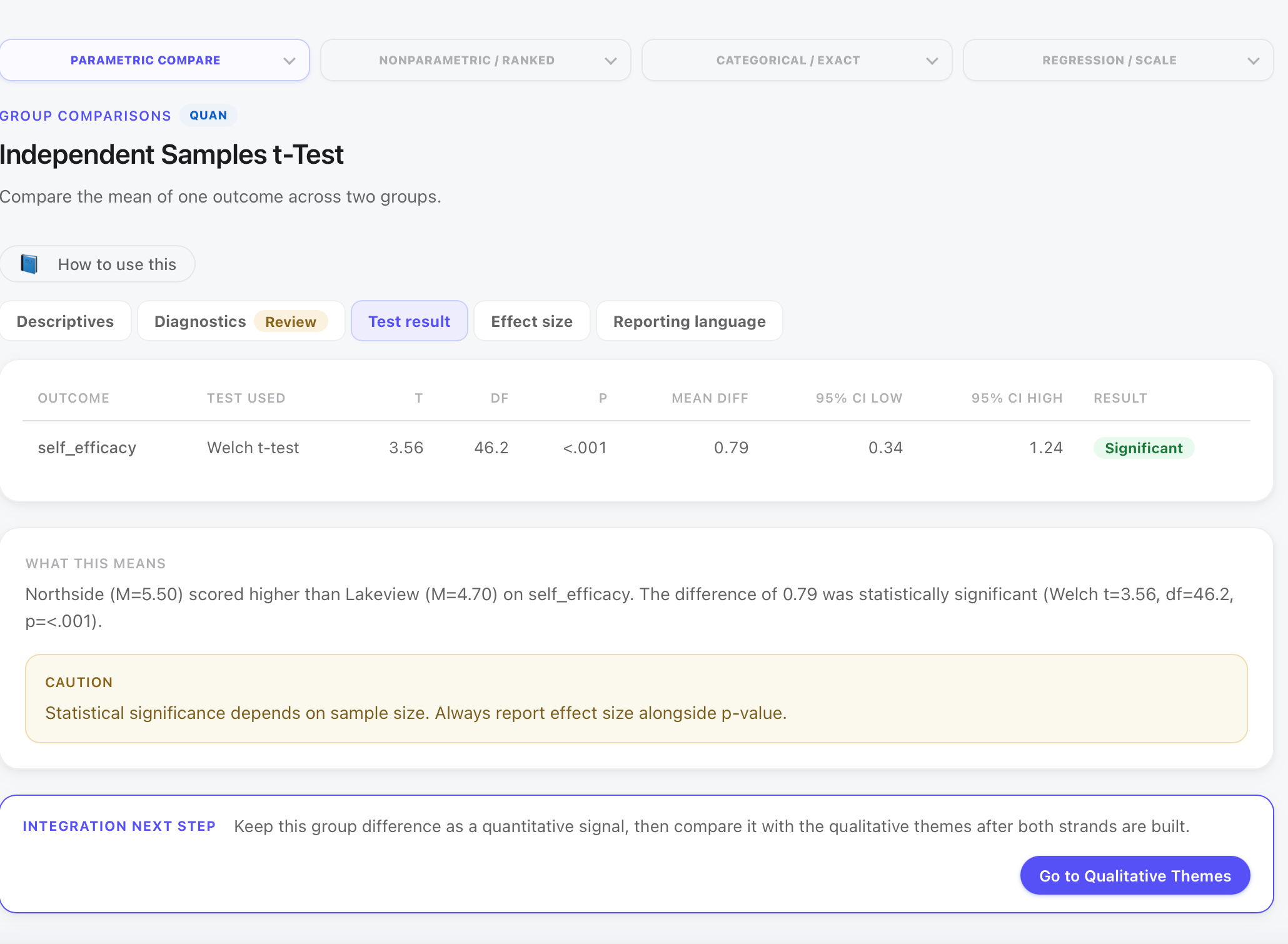
With 25 patients per group, this study is small enough that only large effects will reach conventional significance thresholds. The fact that p < .001 on a 50-person study means the effect is very large, not that the study was well-powered to detect small ones. Cohen’s d = 1.01 is what translates the finding into practical terms: the groups differ by roughly one full standard deviation on the self-efficacy scale. That is a clinically meaningful gap, not a statistical artifact of sample size.
The t-test says self-efficacy differs between clinics. It does not say why. It does not say clinic membership caused the difference. Patients who chose or were assigned to different clinics may differ in ways that self-efficacy also tracks: age, diagnosis history, proximity to resources, insurance coverage. The next step is not to conclude that one clinic produced better self-efficacy; it is to carry this signal forward to the qualitative strand and the merge.
The chi-square test: 92% vs 64%, and what it takes to say that is real
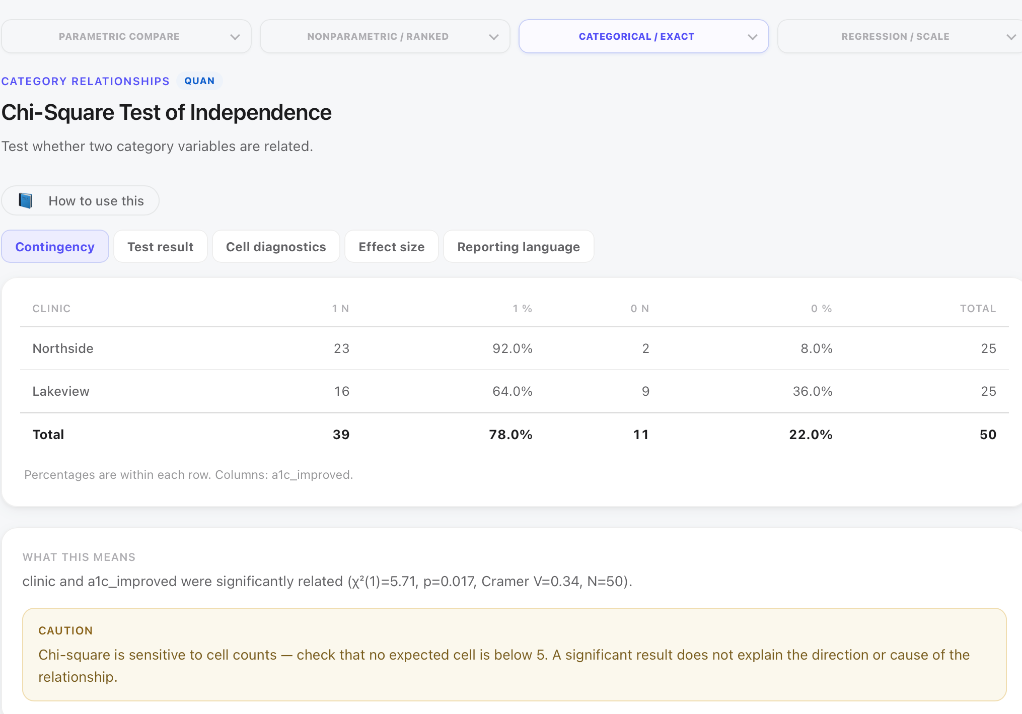
The second quantitative test asks whether the proportion of patients who improved their A1C differs by clinic. The outcome variable (a1c_improved) is binary: yes or no. The grouping variable (clinic) is categorical. Chi-square is the appropriate test.
The contingency table
| Clinic | Improved | % | Did not improve | % | Total |
|---|---|---|---|---|---|
| Northside | 23 | 92.0% | 2 | 8.0% | 25 |
| Lakeview | 16 | 64.0% | 9 | 36.0% | 25 |
| Total | 39 | 78.0% | 11 | 22.0% | 50 |
The percentages in this table are calculated within rows (within each clinic). That is the correct denominator for this question: what share of Northside patients improved? 23 of 25 = 92%. What share of Lakeview patients improved? 16 of 25 = 64%. The total row shows 78% overall improvement across both clinics.
The trap: if you read column percentages instead, asking how many of the improvers came from Northside, the numbers look different and answer a different question. Column percentages tell you about the composition of the improved group, not about each clinic’s improvement rate. For the research question in this study, row percentages are the right choice. Label your percentages and state your denominator.
The chi-square result: what association means
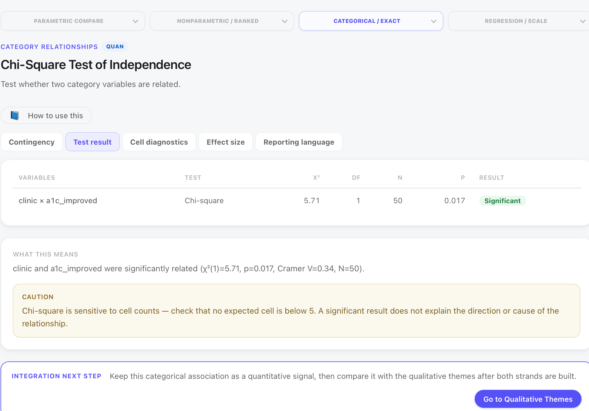
The chi-square result says clinic and A1C improvement are associated, that they are not statistically independent. It does not say clinic membership caused improvement or non-improvement. Patients were not randomly assigned to clinics. Northside and Lakeview patients may differ on socioeconomic factors, access to medication, diet resources, or family support. Any of those could explain the improvement gap alongside or instead of the clinic itself. A chi-square result licenses a claim about association; it does not license a claim about mechanism or cause.
The pre-run screen flagged that the smallest expected cell count is approximately 5.5, borderline for the chi-square assumption that no expected cell falls below 5. With a 2 × 2 table and 50 cases, this is a known constraint. Fisher’s Exact test is an alternative for small samples with sparse cells; it does not require expected cell minimums. In this teaching context, the chi-square result is reported as stated with the caveat noted. A manuscript reviewer may request Fisher’s; it typically produces a similar conclusion here.
Two results, two strands of the quantitative picture: the confidence gap is statistically real and large; the A1C outcome gap is statistically real and moderate. Neither result alone explains why Lakeview patients experienced a different trajectory. That is the job of the qualitative strand.
Qualitative Themes: building six categories from fifty responses
Quantitative Inferential ends with a prompt: keep this result as a signal, then compare it with the qualitative themes after both strands are built. That is the convergent design in practice. Part 2 now turns to the qualitative pipeline.
Step 7 is Qualitative Themes. Fifty open-ended responses are read, and recurring ideas are grouped into themes. MM Studio offers three methods: keyword tagging, code by hand, and semantic tagging. For a fifty-response dataset in a teaching context, the most transparent method is code by hand, reading each response and assigning codes explicitly. Keyword tagging can assist with initial passes, but every response should receive human review before a theme is finalized.
MM Studio’s semantic tagging tool uses language patterns to suggest candidate themes. Those suggestions are a useful starting point for a dataset of hundreds or thousands of responses where manual reading is impractical. For fifty responses, manual coding is faster, more defensible, and less likely to group responses by surface word similarity rather than by meaning. The codebook that comes from hand-coding (Lesson 01 in Part 3) is also more precise because every code decision is deliberate rather than algorithmic.
A theme discovered by the software that no human would have grouped that way is not a finding. It is an artifact.
The six themes that emerged
| Theme | Coded | Coverage | What it captures |
|---|---|---|---|
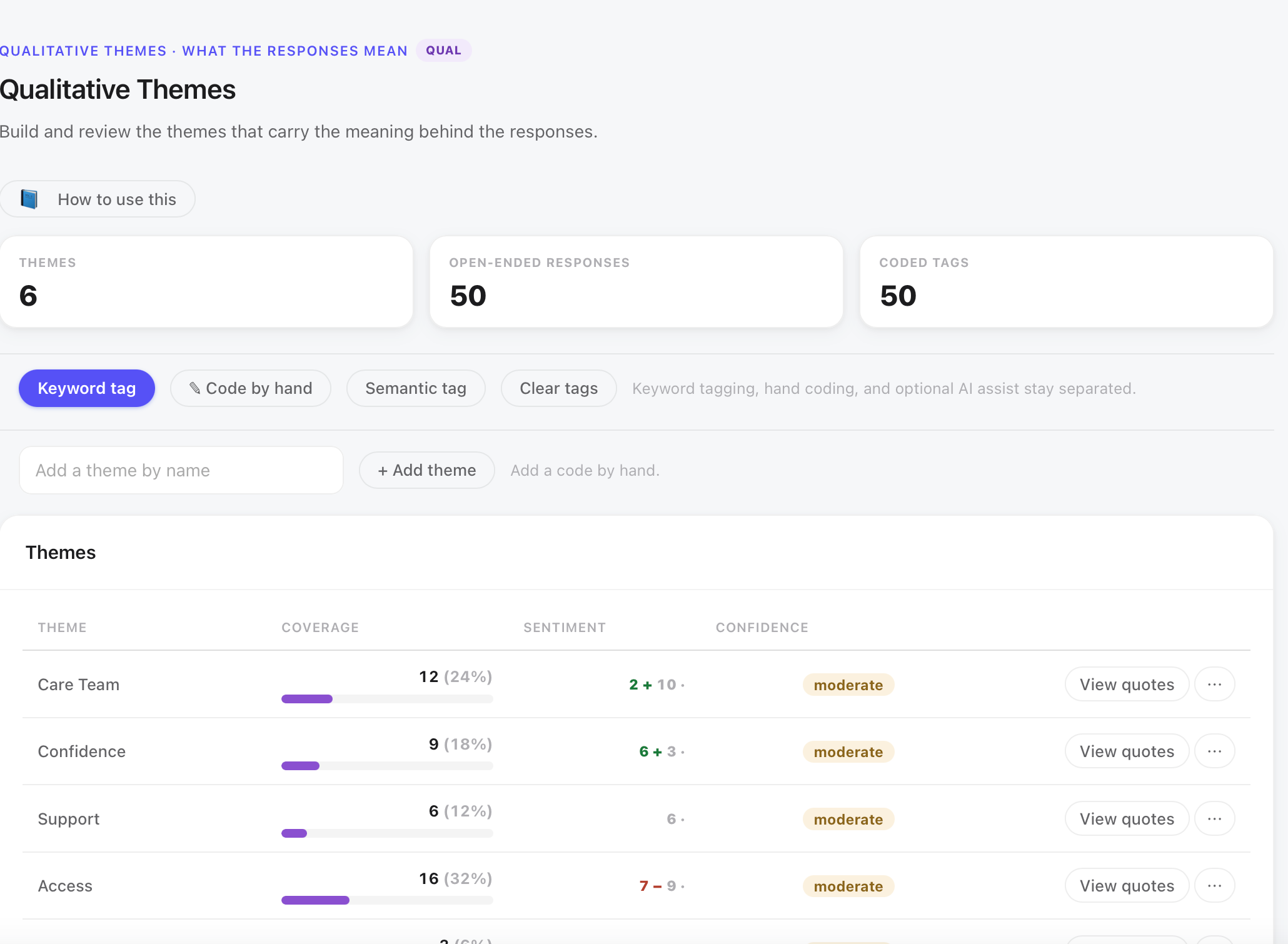
| Access | 16 | 32% | Cost of medication, insurance gaps, food as medicine, structural barriers to adherence |
| Care Team | 12 | 24% | Relationship with coach, nurse, or coordinator; continuity of contact; being heard |
| Confidence | 9 | 18% | Patients describing real self-management: adjusting routines, trusting their own judgment |
| Support | 6 | 12% | Family members, peers, and community as part of managing the condition |
| Overwhelm | 5 | 10% | The plan feeling like too much, especially early in the program |
| Transportation | 3 | 6% | Getting to appointments: a thin theme, but consistent across those who mentioned it |
What the themes mean, and what Access being loudest actually says
Six themes across fifty responses. The most common theme, Access, appears in 16 responses. The natural instinct is to declare it the most important. That instinct needs to be slowed down.
A theme coded to 32% of responses was mentioned by more people than themes coded to 12% or 6%. That is all coverage says. It does not say which theme matters most. It does not say which theme is most tightly connected to the outcome. It does not say which theme should anchor the interpretation.
Coverage can mislead when interpreted as importance because it conflates two different things: how widespread a topic is (Access was mentioned by 16 patients) and how central it is to the finding (Access is where 10 of 11 non-improvers coded, as Part 3 will show). The second fact is what makes Access the key theme in this study, not the 16. The 10-of-11 pattern does not come from the theme list; it comes from the Theme by Group analysis in Part 3.
The sentiment bars in the Qualitative Themes view show mixed positive and negative for Access (roughly 7 positive, 9 negative), while Care Team, Confidence, and Support lean strongly positive. Overwhelm and Transportation have smaller samples but also show some negative lean. This pattern, Access as the lone exception, is already visible before the merge. A student who notices this in Part 2 is beginning to do interpretive work. A student who waits for Part 3 to notice it is reading the merge rather than contributing to it.
The quantitative strand says Lakeview patients improved less often. The qualitative strand says Access is the loudest theme, and the only one with a negative lean. Part 3 asks whether those two facts speak to the same people.
Transportation appeared in three responses. Three out of fifty is 6%. Some researchers would merge Transportation into Access, since both involve barriers to getting to care. Others would keep it separate because the specific barrier, getting to the appointment versus paying for medication, has different intervention implications. In this study, Transportation is kept as its own theme because its three respondents described a distinct experience, and its evidence-strength status (thin theme) will be flagged explicitly in Part 3’s rigor check rather than hidden inside a larger category.
Exit ticket: explain what both strands showed, separately
If you can answer these without looking, you understand each strand, not just its output.
What does Welch’s t-test show that the descriptives table does not?
A colleague reports “92% of Northside patients improved” and “only 22% of total patients did not improve.” Are both sentences correct?
What does Cramér’s V = 0.34 tell you that p = .017 does not?
Access was coded 16 times, more than any other theme. Is it therefore the most important theme?
Why are both strands finished separately before the merge begins?
Two tests and six themes, finished on their own terms. The quantitative strand: a large and significant confidence gap (d = 1.01), and a moderate and significant improvement gap (V = 0.34). The qualitative strand: Access is the loudest theme at 16 coded responses, and the only one with a negative-leaning sentiment. Whether those two strands say the same thing about the same people is the question Part 3 answers.
Reporting language for both strands
Use these when writing the results section for each strand, before any integrated claim is made.
Guide 03: Integration and Reporting. ReliCheck MM Studio · Mixed Methods Teaching Guide 02 of 03. Part 2: Quantitative and Qualitative Analysis · Study: Northside vs Lakeview Diabetes Coaching · N = 50.