 ReliCheck MM Studio · Plain-English Teaching Guide
Guide 03 · Integration and Reporting
ReliCheck MM Studio · Plain-English Teaching Guide
Guide 03 · Integration and Reporting
 Mixed Methods · Teaching Guide 03 of 03
Integration and Reporting
Codebook through report: from finished strands to a defensible finding
A three-part guide to a full convergent mixed methods study in MM Studio. This is Part 3.
Part 3 runs the integration pipeline from Step 8 through Step 19. It begins where the two strands are finished: six coded themes with a codebook, a trustworthiness record, and two quantitative results. It ends with a complete integrated report and an AI disclosure statement. Every step in between is documented as a decision, not just a menu path.
The centerpiece is the joint display, three views of the same data, each asking a different integration question. The theme display asks: do the strands agree at the group level? The case matrix asks: do they agree at the individual level? The discordant case view asks: where do they not agree, and what does that mean for the finding? All three are required before interpretation begins.
Six themes, two tests, three joint display views, and one finding: the patients whose outcomes stayed flat are the same patients describing structural barriers, not low effort. The report is defensible because the integration was honest about where the strands disagreed.
The Codebook: making qualitative evidence reproducible
Step 8 in MM Studio is Codebook and Evidence. It is the step that separates a study where someone coded fifty responses from a study where a second researcher could code the same fifty responses and arrive at comparable results.
A codebook is a rulebook: one entry per theme, each entry carrying five components.
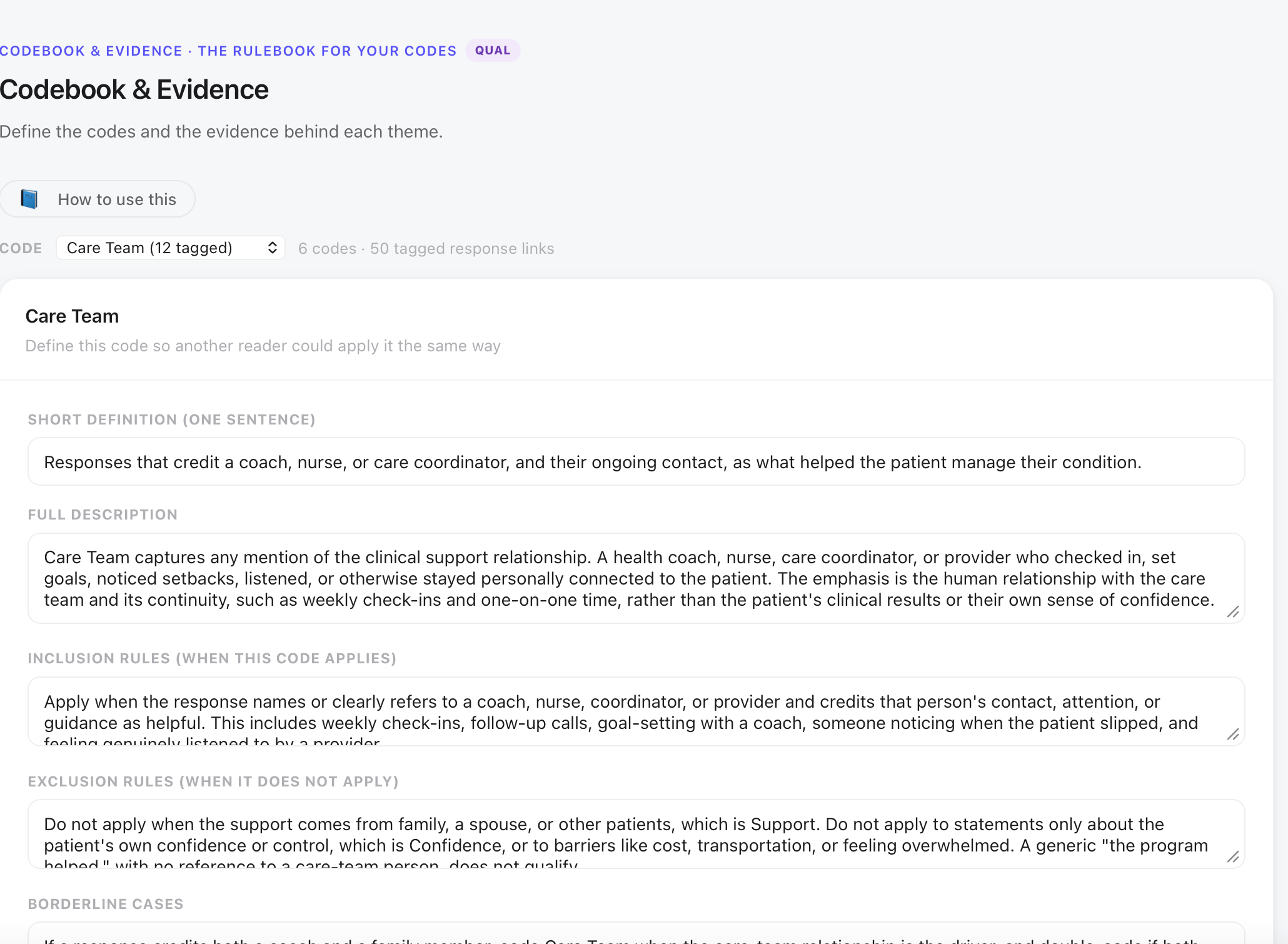
1. Short definition (one sentence). Written so another researcher can apply the code without asking for clarification. Vague definitions produce inconsistent coding. The Care Team entry reads: responses that credit a coach, nurse, or care coordinator, and their ongoing contact, as what helped the patient manage their condition.
2. Full description. Extended explanation of what the theme captures, who typically expresses it, and what range of responses it covers. Care Team’s full description specifies that it captures any mention of the clinical support relationship: a health coach, nurse, care coordinator, or provider who checked in, set goals, noticed setbacks, listened, or otherwise stayed personally connected to the patient.
3. Inclusion rules. When this code applies. For Care Team: apply when the response names or clearly refers to a coach, nurse, coordinator, or provider and credits that person’s contact, attention, or guidance. Include weekly check-ins, follow-up calls, goal-setting with a coach, someone noticing when the patient slipped.
4. Exclusion rules. When this code does not apply. For Care Team: do not apply when the support comes from family, a spouse, or other patients (that is Support). Do not apply to statements only about the patient’s own confidence or control (that is Confidence). Do not apply to barriers like cost, transportation, or feeling overwhelmed.
5. Borderline cases. Responses that could plausibly fit more than one code, with the resolution rule. If a response credits both a coach and a family member, Care Team is the primary code when the care-team relationship is the driver and the family is mentioned incidentally.
Quantitative reliability is built into the measurement (Cronbach’s alpha, test-retest). Qualitative reproducibility is built into the codebook. A theme without a codebook entry is not wrong, but it cannot be audited, cannot be replicated by a second coder, and cannot be defended when a reviewer asks how the code was applied. Writing the codebook is not administrative work; it is the documentation that earns the findings their credibility.
Theme by Group: where the 10-of-11 pattern becomes visible
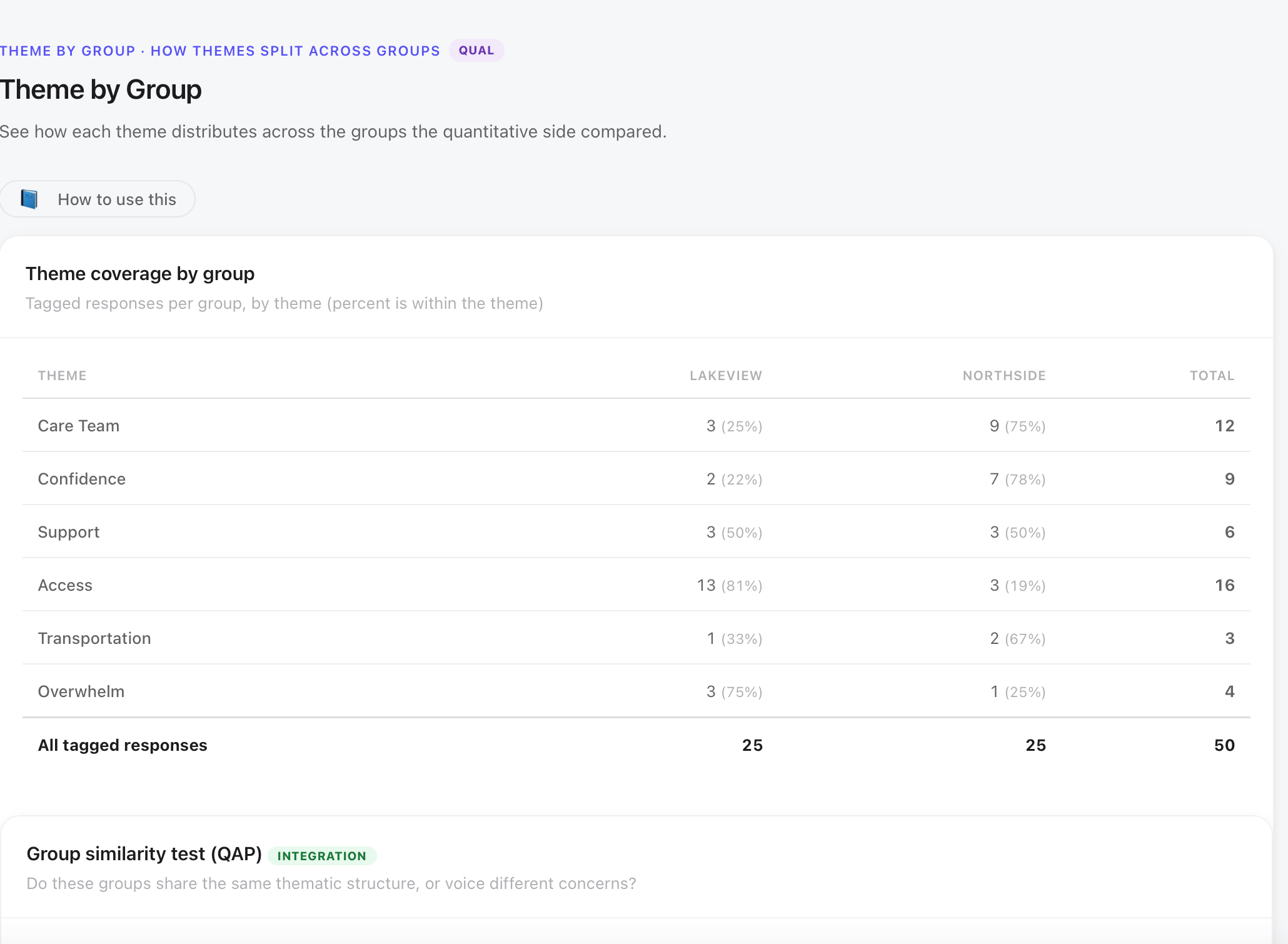
Step 9 is Theme by Group. It cross-tabulates each theme against the grouping variable: how many of this theme’s coded responses came from Northside patients, and how many from Lakeview? This view answers a question the theme frequency list cannot: are the themes distributed evenly across groups, or do certain themes cluster with one clinic?
| Theme | Lakeview | Northside | Total | Pattern |
|---|---|---|---|---|
| Access | 13 (81%) | 3 (19%) | 16 | Lakeview-heavy: structural barriers cluster with the lower-outcome clinic |
| Care Team | 3 (25%) | 9 (75%) | 12 | Northside-heavy: care team contact clusters with the higher-confidence clinic |
| Confidence | 2 (22%) | 7 (78%) | 9 | Northside-heavy: patients describing self-management are mostly Northside |
| Support | 3 (50%) | 3 (50%) | 6 | Even: support networks mentioned equally across clinics |
| Overwhelm | 3 (75%) | 1 (25%) | 4 | Lakeview-lean: early program difficulty mentioned more at Lakeview |
| Transportation | 1 (33%) | 2 (67%) | 3 | Thin theme: too few for pattern claims |
Of the 11 patients who did not improve their A1C, 10 coded Access as their theme. That is the central finding of the study, and it does not come from the quantitative tests. It comes from this table.
The theme-by-group analysis here uses clinic as the grouping variable, which is the grouping the quantitative tests also used, making it the natural comparison. The 13 of 16 Access responses from Lakeview (81%) tells you that the barrier theme is heavily concentrated at the clinic with lower improvement rates. The deeper finding, 10 of 11 non-improvers coded Access, comes from splitting by the A1C improvement variable rather than by clinic. Both views tell the same story: the people who did not improve are the people describing structural barriers. The clinic split makes this visible because Lakeview has nine non-improvers and Northside has two.
Trustworthiness: the audit trail and the one-coder limitation
Step 10 is Trustworthiness. It asks the researcher to document the credibility of the qualitative work: who coded, when, what decisions were recorded, and what the audit trail looks like. Trustworthiness is the qualitative parallel to instrument quality in the quantitative strand. It is what makes the coding defensible to a reviewer who did not witness it.
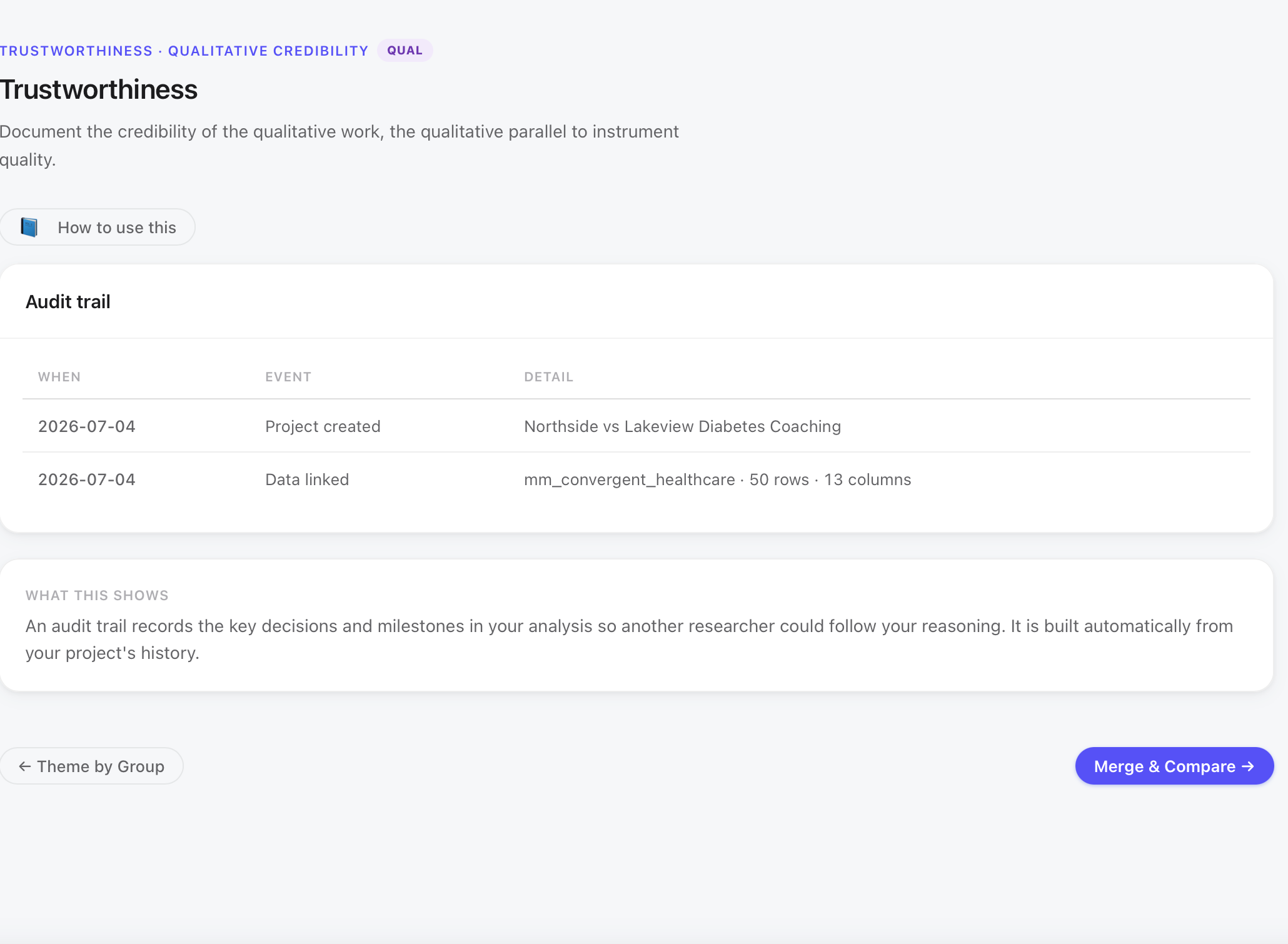
MM Studio builds the audit trail automatically from project history: when the project was created, when the data was linked, when themes were built, when the codebook was saved, when merge steps ran. A researcher who followed the 19-step workflow has a timestamped record of when each decision was made without keeping a separate log. That record is what a second researcher would follow to audit the work.
The Rigor Dashboard (Lesson 12) will flag this study’s only Missing item: coding agreement has not been computed. A single coder coded all fifty responses. This is common in small applied studies and in teaching demonstrations, but it is a limitation that requires explicit acknowledgment. Inter-rater reliability, having a second coder independently code a sample of responses and computing percent agreement or Cohen’s kappa, is the standard way to address it.
In the manuscript: qualitative coding was completed by one researcher; a second coder was not available for this demonstration study; future work should include inter-rater reliability checks using a sample of at minimum 20% of responses. The rigor dashboard’s Missing flag for this item is honest reporting, not a defect to hide.
Beyond the audit trail, trustworthiness in qualitative work includes member checking (did participants review the themes?), negative case analysis (did you actively look for responses that challenged the emerging interpretation?), and reflexivity notes (what assumptions did the researcher bring?). MM Studio provides space for these; none are automated. For a teaching demonstration, the audit trail and the codebook together carry the primary credibility weight.
Merge and Compare: what has to be true before the joint display opens
Step 11 is Merge and Compare. It is the gateway to the joint display. Before the display can be built, every theme row must have three things: coded qualitative evidence, a linked quantitative result, and a representative quote (or a documented acknowledgment that the quote is still being selected). MM Studio shows the status of all six themes in a readiness table.
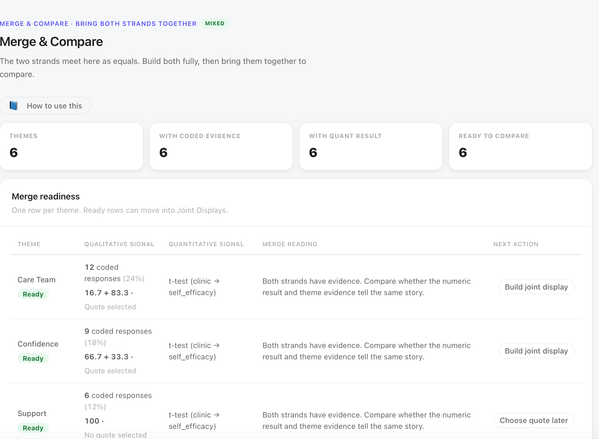
Care Team, Confidence, and Support are all paired with the self-efficacy t-test. They are confidence and relationship themes, and the quantitative variable they speak to is the self-efficacy scale. Access is paired with the A1C chi-square. Access is an outcome theme: the barrier it describes is associated with whether patients improved clinically, not with how confident they felt. Overwhelm and Transportation are also paired with the chi-square for the same reason.
Pairing every theme to the same test would be a mistake. It would imply that all six themes speak to the same quantitative phenomenon, which they do not. Pairing requires the researcher to know what each theme is actually about, and to match it to the result that addresses that construct.
The joint display, View 1: the theme display
Step 12 is Joint Displays. The theme display is the first of three views. It shows one row per theme with four columns: how often the theme appeared (frequency), the statistical result linked to it, the sentiment distribution of coded responses, and a representative quote.
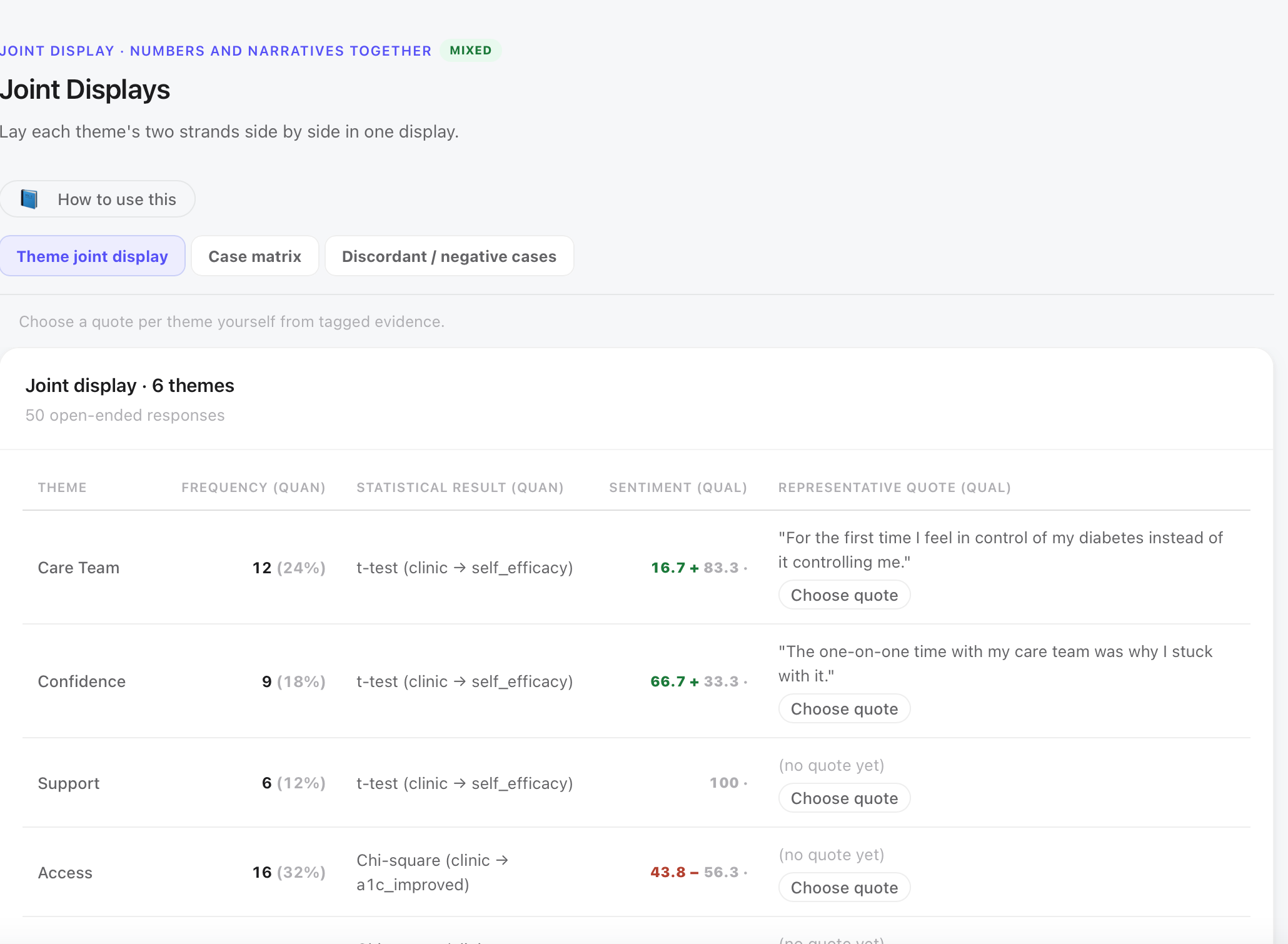
Reading two rows in detail
Patients who coded Care Team describe a clinical relationship that helped them manage their condition. The t-test to which it is linked shows Northside scored higher on self-efficacy, and the Theme by Group analysis showed that 9 of 12 Care Team responses came from Northside. The strands agree: care team contact correlates with higher confidence.
Patients who coded Access describe structural barriers: cost, insurance gaps, food as medicine. The chi-square to which it is linked shows Lakeview had significantly lower A1C improvement. The Theme by Group showed 13 of 16 Access responses came from Lakeview. The sentiment is the only negative lean in the table. Before anyone reads the merge interpretation, these three facts (different linked test, negative sentiment, Lakeview-heavy distribution) are already visible in the theme display. Integration is not reading off the screen; it is seeing those three facts together.
Access appears in 32% of responses, more than any other theme. That frequency matters less than where those responses sit. The theme display cannot show you the 10-of-11 pattern. It can show you that Access has a different linked test and a different sentiment profile. A student who reads only the frequency column and concludes that Access is most important because 16 is bigger than 12 has not integrated; they have counted. Integration requires reading across all four columns, then comparing what the theme display shows with what the case matrix will show next.
The joint display, View 2: the case matrix
The case matrix is the second view. It drops to the individual patient: one row per case, connecting that patient’s quantitative score to their coded theme and a quote from their open response. The case matrix shows the study at the level of real people, not group averages.
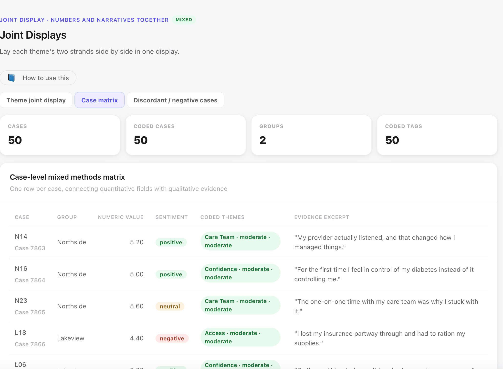
Self-efficacy above the Northside mean. Positive sentiment. Coded Care Team.
“My provider actually listened, and that changed how I manage things.”
Number and narrative agree: strong confidence, relationship-centered explanation.
Self-efficacy below the Lakeview mean. Negative sentiment. Coded Access.
“I lost my insurance partway through and had to ration my supplies.”
Number and narrative agree: low confidence, structural barrier explanation.
The theme display works at the group level. Group-level agreement can hide individual-level contradiction. Two clinics can differ on average while substantial numbers of individuals inside each clinic behave like patients at the other. The case matrix is where you find those people, and where the study stops being about statistical categories and becomes about the person who lost insurance mid-program.
L06 (Lakeview, score 3.00, positive narrative) is visible in the next row of the matrix. A score of 3.00 is more than two standard deviations below the Lakeview mean. The narrative is positive. That discordance, low number and good story, is exactly what the discordant case view exists to surface and examine before interpretation is locked in.
The joint display, View 3: discordant and negative cases
The discordant and negative case view is the third view in the joint display. It hunts for the patients who do not fit the pattern before the researcher writes the interpretation. MM Studio runs this automatically; the researcher reads the results before concluding anything.
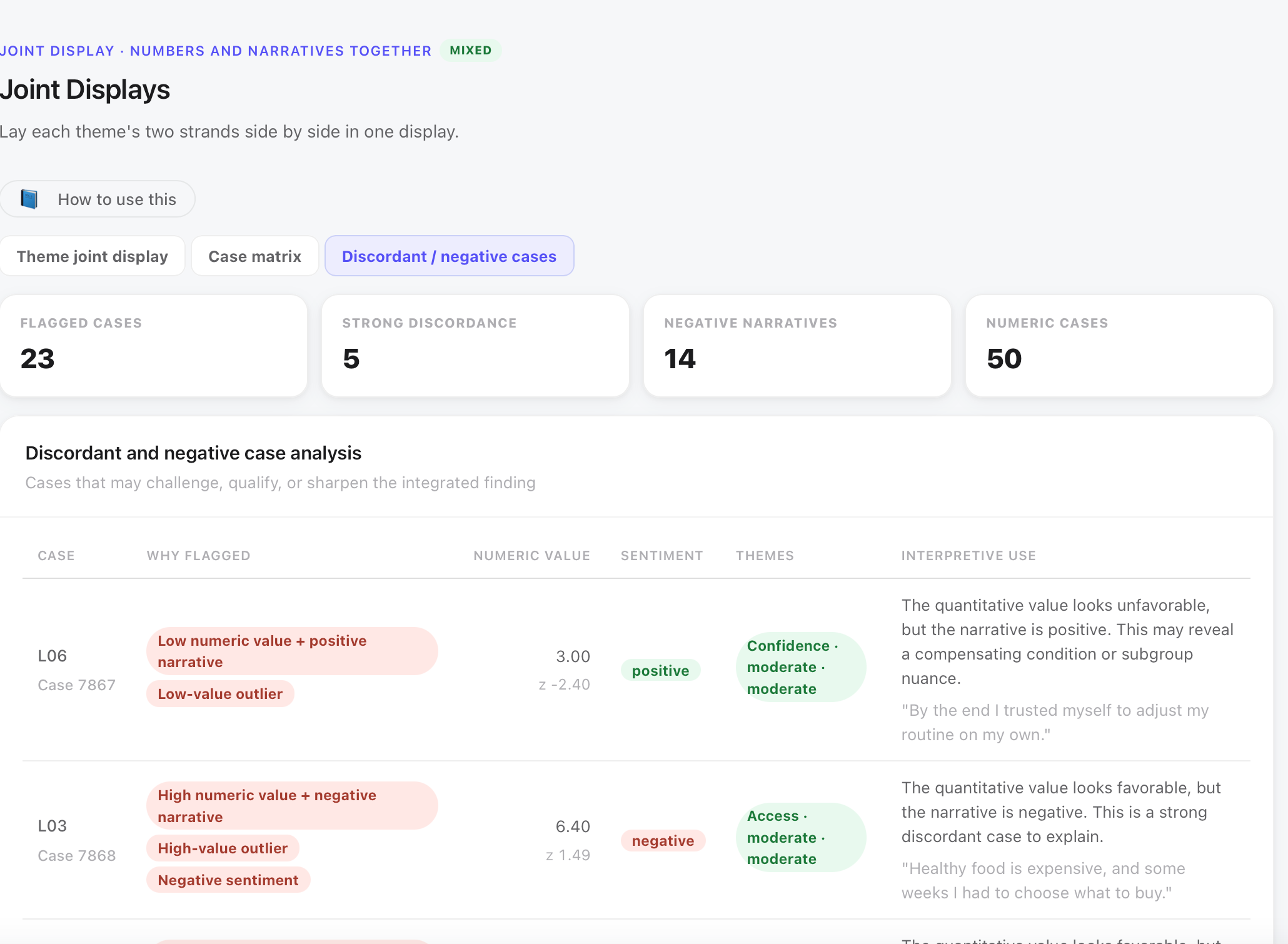
Self-efficacy 3.00, more than two SDs below the mean. Narrative positive: by the end I trusted myself to adjust my routine on my own. The number says this patient struggled to feel capable; the words say they found confidence despite everything. This is not a data error. It is a patient whose self-report at the moment of the survey and their narrative of what the program did for them are telling different stories. Both are real. The discordant flag is the prompt to ask which is more informative for the finding.
Self-efficacy 6.40, nearly 1.5 SDs above the mean, in the strong zone. Narrative: healthy food is expensive, and some weeks I had to choose what to buy. Access coded, negative sentiment. This patient is the most important row in the study for interpretation: a good number, and a structural barrier that the number does not show. This case is what stops the conclusion that Lakeview patients were less engaged. This patient was engaged enough to score 6.40, and still faced a barrier that confidence alone could not clear.
A case that contradicts the pattern is not a problem. It is usually the most informative row in the study, and the most important one to read before writing the conclusion.
The Contextual Lens: what must not be concluded
Step 13 is Contextual Lens. It asks the researcher to review each theme through six reflective frames before writing the integrated interpretation. The lenses are Context, Voice, Position, Representation, Counter-patterns, and Consequence. Each produces a short written reading that stays with the theme and carries forward into the final report.
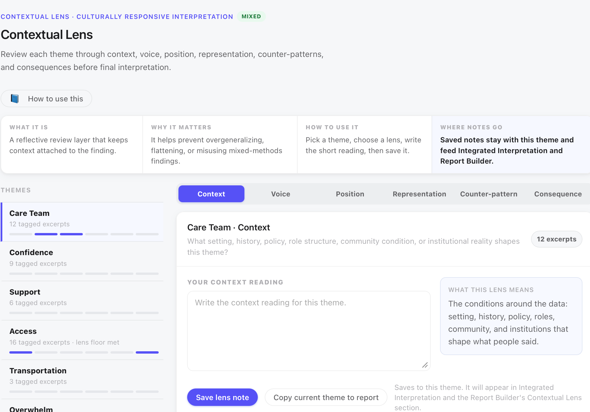
What each lens forces you to write
| Lens | What it asks, applied to this study |
|---|---|
| Context | What institutional, community, or historical conditions shape this theme? For Access: food security, insurance coverage, medication cost, the structural landscape that Lakeview patients navigate. |
| Voice | Whose perspective is represented, and whose is missing? The survey captured patients who completed enough of the program to respond. It did not capture patients who dropped out before the survey point. |
| Position | What is the researcher’s relationship to this topic? A clinician-researcher has different assumptions about access than a health economist or a patient advocate. |
| Representation | Does the theme represent a broad group or a specific subgroup? Access at 16 of 50 represents a real portion, but it is not a majority finding. |
| Counter-patterns | Which responses coded Access look different from the typical Access narrative? L03, with a 6.40 score, is a counter-pattern worth naming. |
| Consequence | What claim must not be made from this finding? Do not frame Lakeview patients as non-compliant. Do not attribute the outcome gap to effort or motivation. |
The Consequence frame for Access in this study produces the sentence that is the difference between a finding that helps a clinic and one that harms patients: do not frame Lakeview patients as non-compliant. The joint display already shows that non-improvers described barriers. The Contextual Lens makes sure the interpretation does not walk back to the blame narrative through careless word choice in the report.
Convergence and Divergence: naming where the strands agree and where they split
Step 14 is Convergence and Divergence. For each theme, the researcher names whether the quantitative and qualitative strands converge (agree), expand on each other (nuanced), or diverge (contradict). The call is not automatic; it is a judgment entered after reading the theme display, case matrix, discordant view, and contextual lens readings.
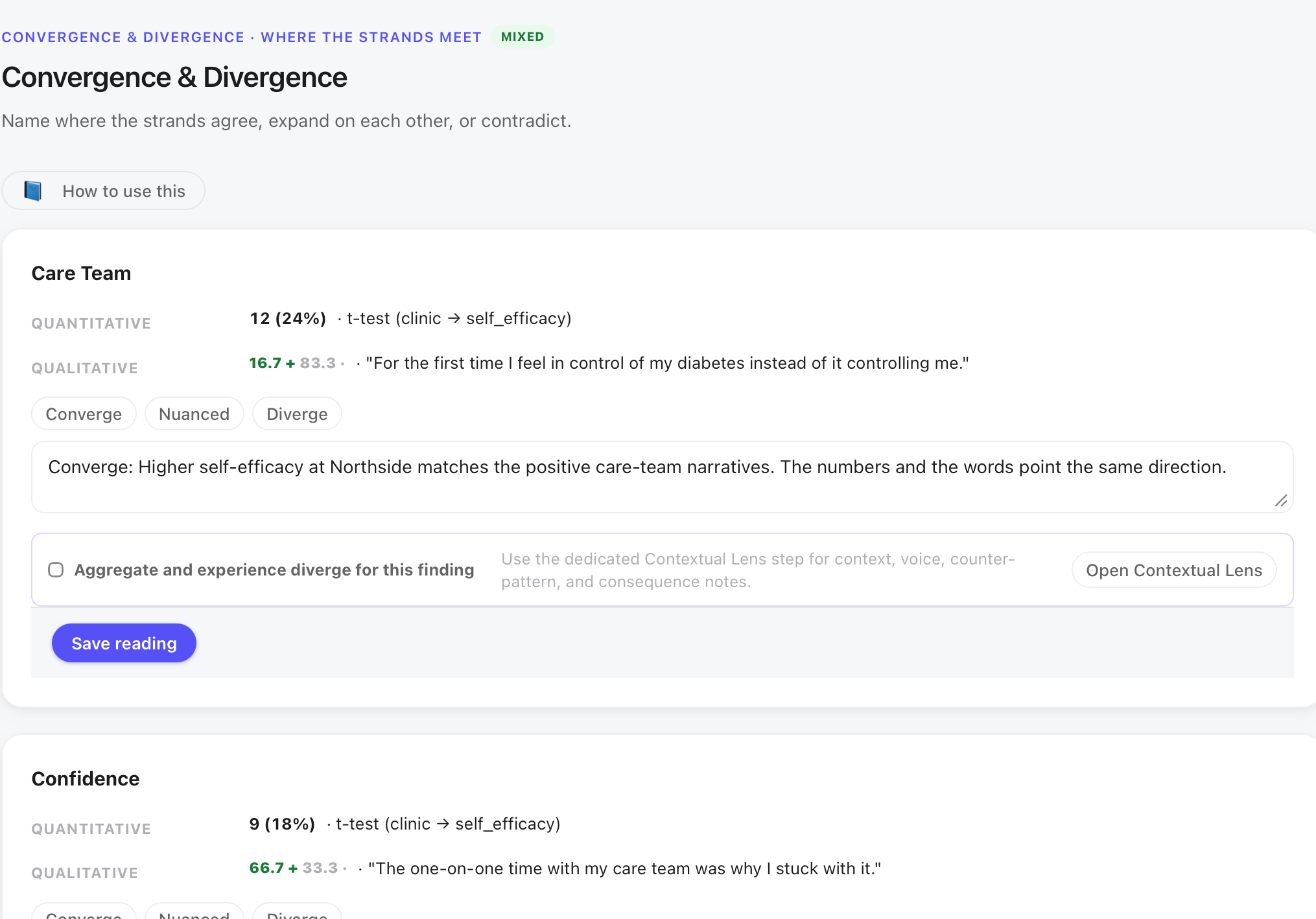
| Theme | Call | Reading |
|---|---|---|
| Care Team | Converge | Higher self-efficacy at Northside matches the positive care-team narratives. 9 of 12 Care Team responses came from Northside. The numbers and the words point the same direction. |
| Confidence | Converge | Confidence narratives cluster with higher-efficacy patients. The t-test result and the theme distribution align. |
| Support | Nuanced | Support appeared equally at both clinics. It does not distinguish the groups; it describes something both populations experienced. A nuanced call acknowledges the theme without overclaiming its explanatory power. |
| Access | Diverge | The critical call. At the aggregate level the chi-square shows a 28-point improvement gap by clinic. At the experience level, Access narratives are 81% Lakeview-concentrated and the 10-of-11 pattern shows non-improvers describing structural barriers. Naming Access as divergent sends the analysis back to the Contextual Lens and produces the Consequence note: do not attribute the gap to patient behavior. |
| Overwhelm, Transportation | Nuanced | Both appear and both lean slightly Lakeview, but with thin evidence (5 and 3 responses), the call is nuanced rather than diverge. |
When you mark aggregate-versus-experience divergence, MM Studio sends you back to the contextual lens on purpose. That is the dangerous moment in mixed methods: the number looks like a group failure; the words say resources. Naming the split without explaining it is how blame sneaks back in.
Meta-inferences: what only the merge can claim
Step 15 produces meta-inferences: integrated claims that neither strand alone could support. These are the findings of the mixed methods study, distinct from the findings of each strand. Each meta-inference must cite both the quantitative evidence and the qualitative evidence that together earn it.
Four meta-inferences from this study
- 01The program builds real self-management confidence. The t-test shows a large and significant efficacy gap (d = 1.01) favoring Northside. Confidence narratives cluster with Northside patients and describe specific self-management behaviors. Together: the coaching model is working, and Northside patients internalized it more fully.
- 02The clinic outcome gap is an access effect, not a program or patient failure. The chi-square shows a significant improvement gap (V = 0.34). Access narratives are 81% Lakeview-concentrated, and 10 of 11 non-improvers described access barriers. Together: the gap traces to structural barriers to adherence, not to program quality or patient motivation. This is the finding that changes what a clinic should do next.
- 03Care team contact is the engagement lever. Self-efficacy correlates with Care Team narratives, which cluster with Northside. Together: the relationship between coach and patient, continuity, goal-setting, noticing setbacks, is what translates program attendance into confidence gains.
- 04Early overwhelm and transportation are fixable friction. Both Overwhelm (5 responses) and Transportation (3 responses) appear with a Lakeview lean and thin evidence. Neither is strong enough for a confident claim, but both describe specific, addressable barriers. Together: the evidence is too thin to assert a finding, but sufficient to flag for a follow-up study with more targeted data collection.
None of those four come from numbers alone or words alone. The numbers say what happened; the words say what was happening while it happened. The meta-inferences say what both mean together.
A meta-inference is not a re-statement of the quantitative result with a quote attached. Saying that self-efficacy differed significantly and patients said care team contact mattered is proximity, not integration. A true meta-inference makes a claim that requires both strands as evidence: the program’s confidence effect is concentrated where care team relationships are strongest, and blocked where structural barriers interrupt adherence. That claim cannot be made from the t-test alone, and it cannot be made from the Care Team and Access themes alone. Both are required.
Evidence Strength: thin themes and what to do about them
Step 17 is Evidence Strength. It runs automated checks on the integrated evidence before the report is built. The checks assess whether the quantitative results have meaningful effect sizes, whether the theme set is stable, whether individual themes have sufficient coded responses to support claims, and whether the response coverage is adequate.
| Check | Status | Finding |
|---|---|---|
| Effect size sanity | Pass | No significant tests with negligible effect sizes. d = 1.01 and V = 0.34 both clear the floor. |
| Theme saturation | Pass | No themes appear only in the last 20% of responses. The theme set was stable before the final responses. |
| Theme support (minimum coded responses) | Review | 2 of 6 themes have fewer than 5 coded responses: Transportation (3) and Overwhelm (5, borderline). Consider merging or flagging as thin. |
| Theme-to-response coverage | Pass | 50 of 50 responses have at least one usable theme code. |
| Total response count | Pass | 50 responses on file. |
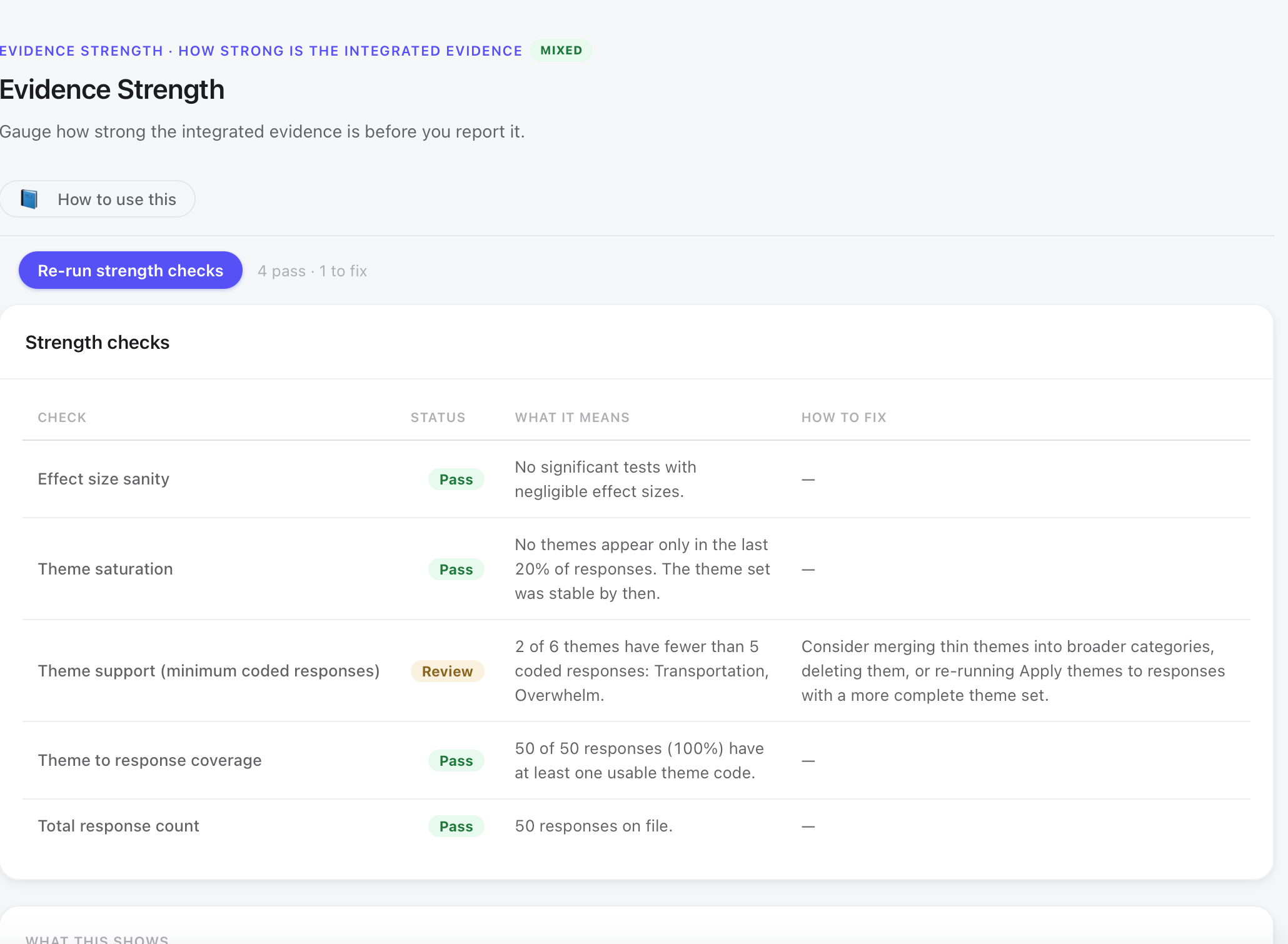
Transportation (3 responses) and Overwhelm (5 responses, borderline) are flagged. The decision in this study is to retain both, as thin themes with explicit disclosure rather than merging them into Access and losing the distinction between structural barriers (Access) and experiential barriers (getting to appointments, early program difficulty). The report will flag both as thin themes with insufficient evidence for confident claims, note that they warrant follow-up, and recommend a study with targeted data collection for these barriers. Keeping them visible is more honest than absorbing them into a larger category that buries the distinction.
Rigor Dashboard: plain-language readiness before the final report
Step 18 is the Rigor Dashboard. It consolidates all project checks into a plain-language readiness review: Strong (ready signals), Needs Review (human check needed), and Missing (not yet addressed). The goal is not to achieve all greens. It is to know exactly what the study has, what is incomplete, and what to say about each in the report.
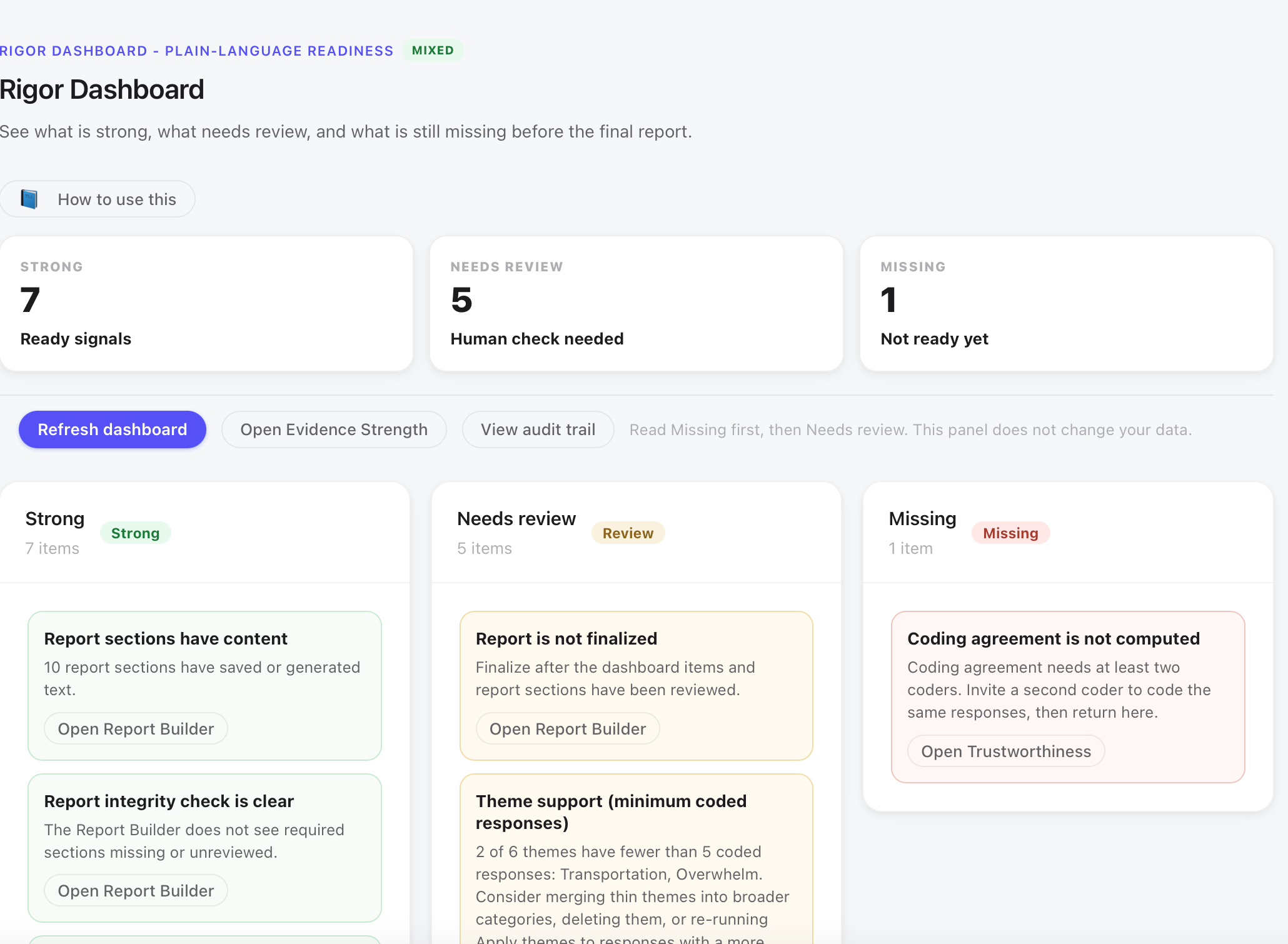
Do not chase green. A dashboard of 7 Strong, 5 Review and 1 Missing with accurate documentation is better rigor practice than 13 Strong achieved by reclassifying incomplete items.
The rigor dashboard turns the project’s state into plain language so the researcher, and ultimately any reviewer, can see exactly what was done and what was not. Researchers who use it this way arrive at the report step with no surprises and no gaps to hide.
Report Builder: assembling one defensible document
Step 19 is the Report Builder. It assembles all staged results, coded themes, joint display views, contextual lens readings, meta-inferences, and trustworthiness documentation into a structured integrated report. The researcher reviews and finalizes each section; nothing publishes automatically.
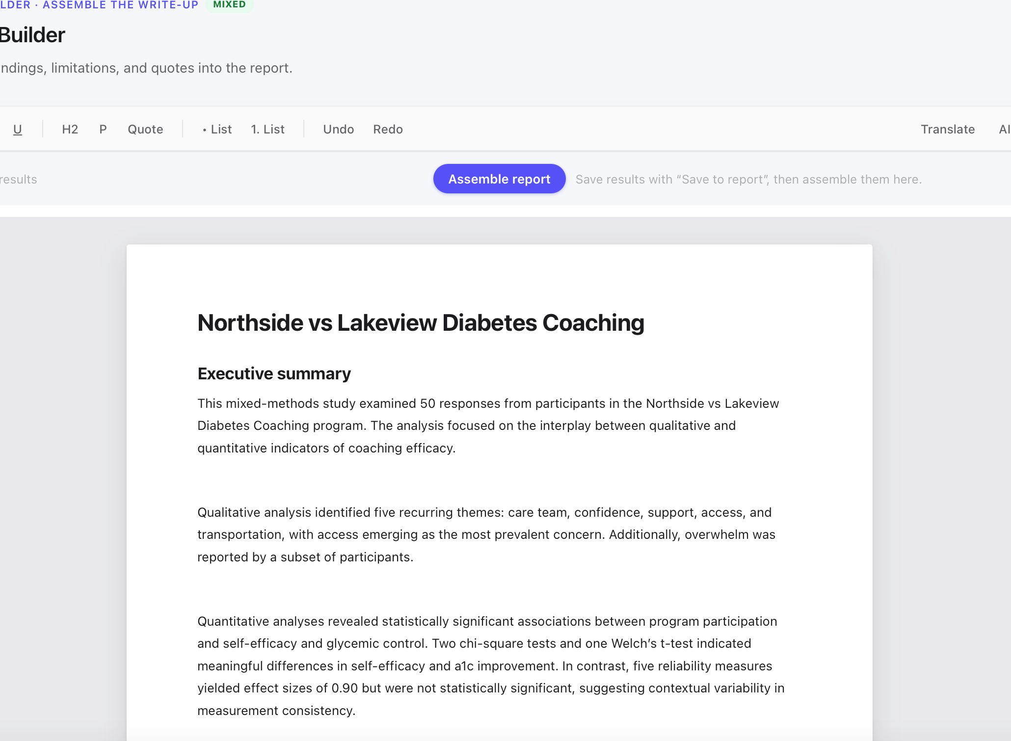
The Report Builder assembles sections in standard research order: executive summary, abstract, methods (quantitative and qualitative), quantitative findings, qualitative findings, integrated findings, implications, and limitations and trustworthiness. Each section draws from a corresponding step in the 19-step workflow. The researcher can insert whole sections or individual blocks, then edit within the report.
The Report Builder includes an AI assist option in the editing bar. If the researcher uses ReliCheck Intelligence to draft or revise any section of the report, that use must be disclosed. MM Studio generates a disclosure statement for the report’s limitations section: noting that AI-assisted language generation was used in preparing the report, specifying which sections were AI-drafted, and confirming that all statistical interpretations and qualitative judgments were reviewed and approved by the researcher.
The integrated report claims four meta-inferences, supported by both strands. It does not claim causation. It does not claim that removing access barriers would immediately close the improvement gap. It does not claim the qualitative findings are generalizable beyond these fifty patients. It does note that the findings are consistent across multiple levels of analysis (group statistics, individual case matrix, discordant case review) and that the one-coder limitation warrants a replication with inter-rater reliability checks. That is the scope of what this study can honestly say.
Exit ticket: defend the integration
If you can answer these without looking, you understand the integration, not just the steps.
Why does the Access theme pair with the chi-square and not the t-test?
What does the case matrix show that the theme display cannot?
Access appeared in 32% of responses. Is that what makes it the key finding?
The Rigor Dashboard shows 1 Missing, coding agreement not computed. What do you do?
What conclusion does the Contextual Lens prevent, and why does that matter?
Two clinics, same program, different outcomes. The data preparation found a clean dataset with two decisions to document. The quantitative strand found a large confidence gap and a significant outcome gap. The qualitative strand found six themes, Access loudest and the only one with a negative lean. The integration found that the people whose numbers stayed flat are the people telling you the barrier was access, not effort. That finding did not come from the numbers alone or the words alone. It came from putting both strands in the same table and reading what they said about the same patients.
Reporting language for integration, limitations, and AI disclosure
Use these when writing the integrated results, limitations, and disclosure sections of a manuscript.
Guide 01 (Introduction and Data Prep) and Guide 02 (Quantitative and Qualitative Analysis). ReliCheck MM Studio · Mixed Methods Teaching Guide 03 of 03. Part 3: Integration and Reporting · Study: Northside vs Lakeview Diabetes Coaching · N = 50.